Over the winter I’ve been taking a lot of photos of an orchid plant in my back room. Whenever the winter light emerges from our frequently-grey skies I’ll try to take a shot or two. One afternoon in mid-December a thin beam of light snuck through a mostly-closed curtain and hit the orchid just so and I managed to take a couple of shots.
I mentioned that I wanted to talk about this shot more in the pushing Ilford post last week. Now it’s time!
After developing and scanning I got this
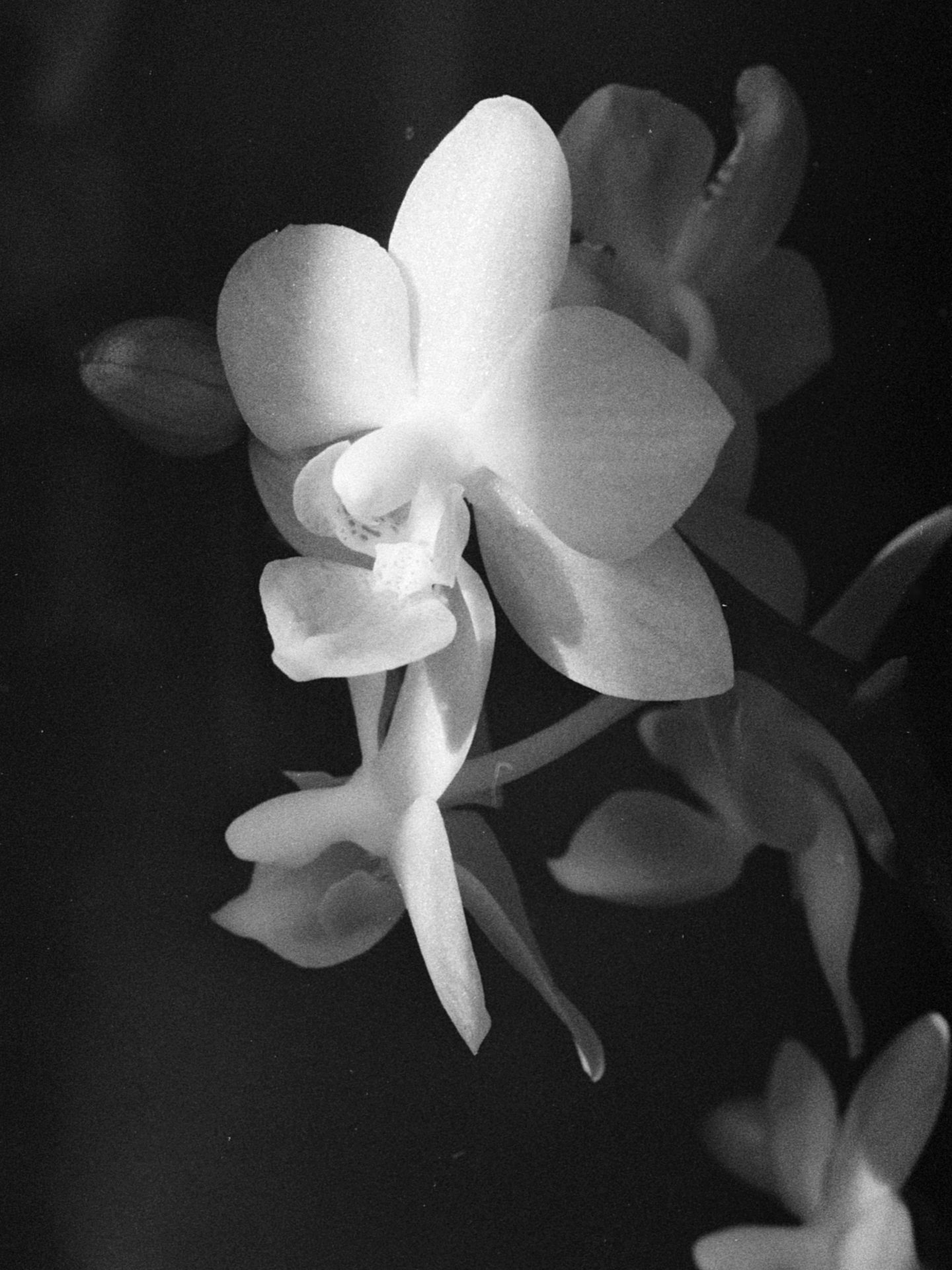
That’s not exactly how it came out of the scanner. As with any black-and-white scan there are some small adjustments. I’ve trimmed the levels to match the range of the photo. I gave the curves a slight s shape. But that’s about it.
And…it’s fine. Pretty good. But it’s not the picture I visualized when taking the shot. The beam of light is strong, but not strong enough. And the background flowers are dim, but not dim enough. I was looking for more contrast and a more defined beam of light than I got here.
In a photo editor I can do whatever I want. I don’t usually tweak scans a lot, but I did in this case to bring the photo more in line with my visualization.
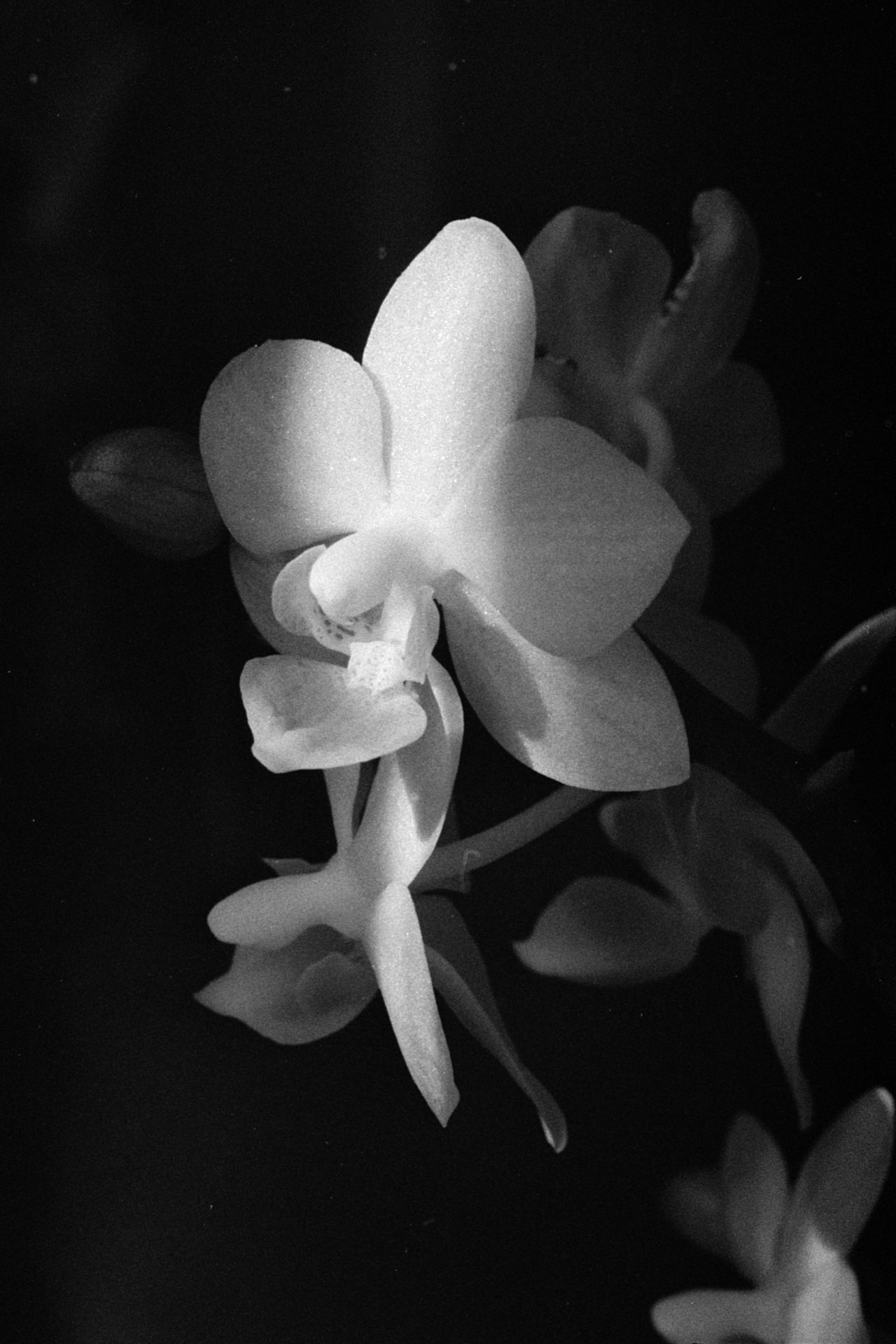
And I like that a lot more. But I wanted to make a silver gelatin print to match it and I wasn’t sure how to go about it.
I started with a normal test strip using f-stop timings and an Ilford 2 filter.
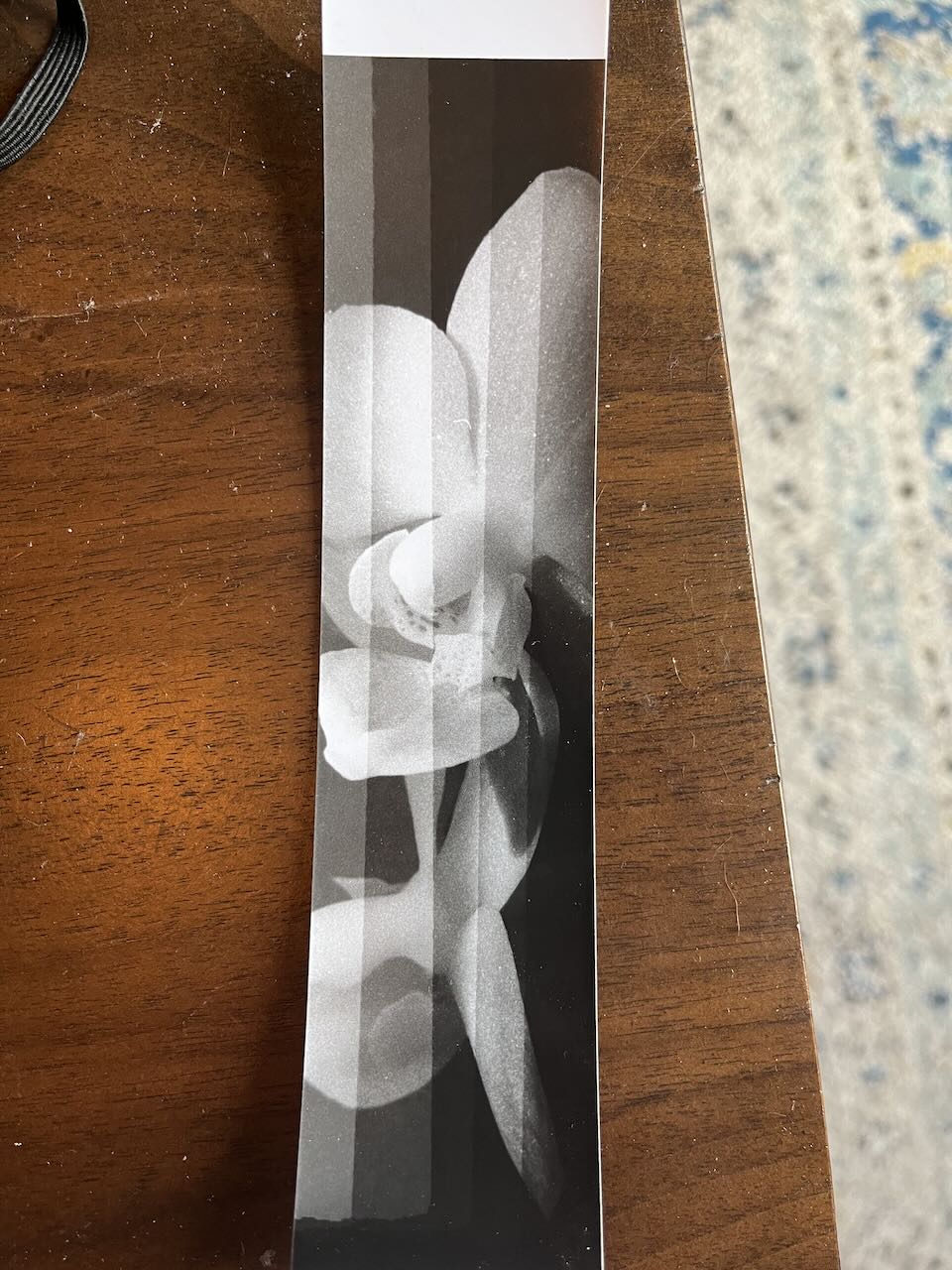
For all of my tests strips I focused on this section of the image as it contained the main details I wanted to get right, the strip of light and the dark shadow surrounding it.
Based on this strip I wasn’t sure if 10 seconds was too dark, so I did a quick test at 8.4 seconds (1/4 stop between 7.1 and 10) to compare. It was too light, so I stuck with 10 seconds.
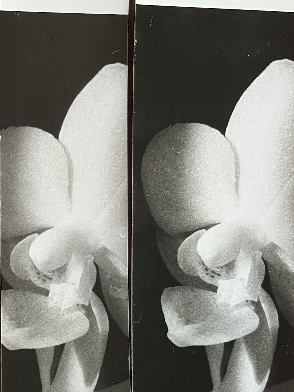
With my timing determined, I turned to contrast and made more test strips from using Ilford filters 0, 1, 2 and 3. All of these were exposed for the base time of 10 seconds.
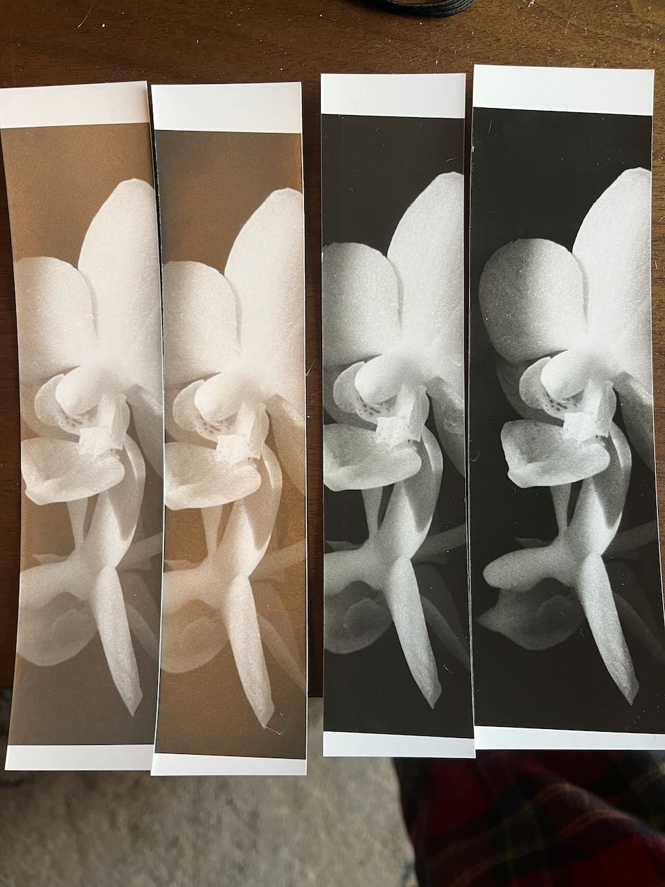
The higher & harder contrast filters are where I start to see the sharpness of the light beam match what I want. At the lower contrasts the beam kind of fades in out of the shadows. But at Ilford 3 there’s a crisper division.
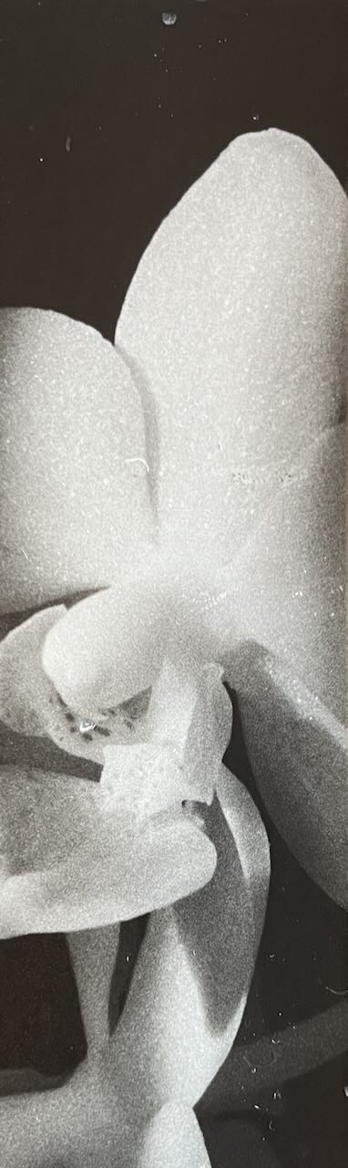
But Ilford 3 also has a problem. Here’s a zoom in on the highlights.
At higher contrast I’m losing the faint highlight detail on the petals. If I push in to even higher contrast I’ll lose even more detail. And I wanted some texture on the petals in my final print.
So I decided to try pre-flashing, a technique I hadn’t tried before. After a few tests to determine the amount of pre-flashing my paper needed I made this test strip.
Here I’ve lost the contrast that I liked in the Ilford 3. This is a known thing about pre-flashing; it reduces the contrast of your final photo. Something I could have done here is to change the exposure to Ilford 4 or 5 to see the effect it had. But I didn’t do that for some reason. Maybe I’ll give it a try later.
What I decided to do was change tack and use split-grade printing. I figured this would let me retain the faint highlights of the petal while still achieving the harder contrast I wanted in the shadow. I made more test strips using different ratios of exposure time at Ilford 5 and Ilford 0.

I eventually found a mix that gave me the results I liked. A strong shadow border combined with details on the bright parts of the flower. In an attempt to deepen the blacks of the photo even more I toned it in a weak selenium solution (1:20) for about 4 minutes. As I understand it this will ‘increase the dmax’. Or, to put that in terms that I understand, make the blacks darker.
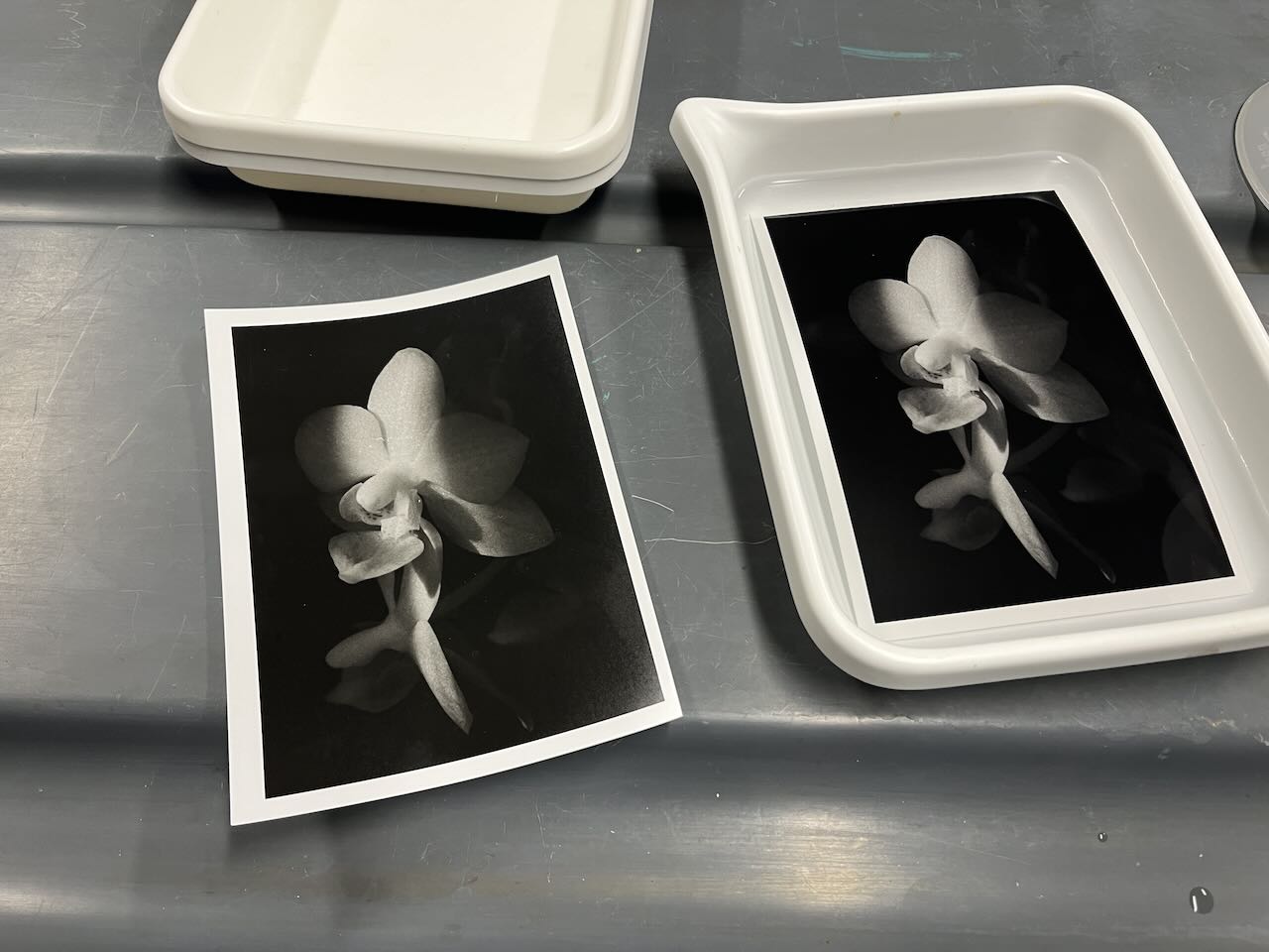
And the final result, taped in to my darkroom notebook.

The glare on the print in this photo doesn’t help much, but I find that the print itself is a very good first draft at the print I want to make of this negative. Let’s compare it to the digital version of this photo

I think I can say that I’ve made a print that closely matches the digital version. My print pushes the background flowers more in to shadow than the digital one does, which I prefer. On the flip side, I think the highlights on the digital print are nicer than on the physical print. But, overall, I think this is a good first attempt.
Thanks for reading! You can always keep up to date by adding the site to a RSS reader or follow me over on Mastadon at https://mastodon.art/@ianwhitney. You can also subscribe for email notifications.
Leave a Reply